Why Public Transport Maps Make Sense Until You Actually Use Them
Explore the complexities and challenges of using public transport maps effectively.
Public transport maps are designed to be helpful, allowing commuters to navigate complex transportation systems with ease. While they may seem logical at first glance, the reality of using them often reveals a different story. This article will explore the challenges and intricacies of public transport maps, highlighting why they make sense conceptually but can be overwhelming in practice.
The Purpose of Public Transport Maps
The primary goal of public transport maps is to provide passengers with an overview of the transport network, indicating routes, stops, and connections. They serve as a tool for both locals and visitors, transforming the often chaotic experience of navigating urban transport into a more structured journey. In an ideal world, these maps would provide all the necessary information in a clear and concise manner, making commuting a breeze.
The Aesthetic Appeal
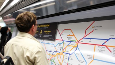
Many transport maps are designed with aesthetics in mind, using colors, symbols, and various graphic elements that can make them visually engaging. This design aspect is important as it can attract more users to the public transport system. A well-designed map may persuade an individual who typically drives a car to consider taking the bus or train instead. However, this attractiveness can sometimes overshadow the practicality of the map's content. Users may find themselves dazzled by visuals yet lost in intricacies that don't translate well to real-world application.
Understanding Symbols and Icons
Every public transport map has its own set of symbols and icons, each with specific meanings. While some icons are fairly universal—like bus and train symbols—others can cause confusion. Different systems may employ unique designs for similar services, requiring users to adapt to new ones each time they use different systems. When faced with a map filled with unfamiliar symbols, commuters may find it challenging to decipher the information accurately.
Simplifying Complex Networks
Public transport maps often aim to simplify a complex network into an understandable format. This is a monumental task, especially in cities with numerous lines, transfers, and intersections. While simplification can be helpful, it can also lead to misrepresentations. Distances may appear shorter or longer than they are, and the relationship between lines might not be accurately depicted. In some cases, the routes displayed on the map may not adhere closely to the real-world geography of the city.
Challenges of Interpretation
Even after a user has familiarized themselves with the symbols and layout of the map, interpreting the information can be a challenge. For newcomers, it may not be immediately clear which mode of transportation will get them where they need to go. The absence of context can make it difficult to determine the quickest or most efficient route. Furthermore, the expected journey may be disrupted by delays or service changes, adding uncertainty to any plan that was made based on the map.
Human versus Digital Maps
While many still rely on traditional paper maps, the rise of digital navigation tools has changed the landscape significantly. Mobile applications offer real-time updates, route suggestions, and alerts for delays—features that static maps simply can't compete with. That said, there's still a substantial number of people who prefer paper maps; they provide a tactile reference that some find comforting. However, even in the case of digital tools, the accuracy and efficiency can depend on user interpretations of the presented information.
Newcomers and Overwhelmed Tourists
For newcomers to a city or tourists, public transport maps can be particularly daunting. After all, unfamiliarity with the geography can make it hard to understand where you are in relation to the network. Often, first-time users may take a wrong turn or get off at the wrong stop due to a misunderstanding of the map’s layout or the symbols. Furthermore, lacking local knowledge, they might struggle with the timings and operational hours of the services. This conundrum can lead to frustration, which may discourage individuals from utilizing public transport as a viable option.
Accessibility Issues
Another significant point to consider is accessibility. Not all public transport maps cater to the needs of people with disabilities or those requiring additional assistance. Key information regarding accessible routes or facilities may be missing or not highlighted adequately. This can severely limit the usability of the public transport system for certain groups, making otherwise logical maps ineffective in a real-world setting. As a result, the very goal of promoting inclusivity through public transportation can be undermined.
The Impact of Cultural Differences
Culture can also influence how maps are perceived and utilized. What may be straightforward for a local resident can be perplexing for someone from a different cultural background with varying experiences using transport systems. The differences in language, symbols, and even the logic of organizing transport routes can change the perceptions of the system’s ease of use. This cultural variance makes it essential to create maps that are accommodating to an array of users with different experiences and requirements.
The Future of Public Transport Maps
As technology evolves, so too might the concept of public transport maps. Innovations such as augmented reality (AR) could offer engaging ways to visualize transportation networks. By overlaying navigation data onto real-world views, AR systems could simplify orientation and wayfinding for users. This advancement could potentially ameliorate many of the current limitations that static maps impose. Additionally, adaptive applications that respond to user preferences and provide personalized information may also address several usability issues.
Bridging the Gap
Ultimately, while public transport maps provide an essential service by outlining the routes and connections within a transport network, they require ongoing improvement. Enhancing the clarity and usability of these maps may help bridge the gap between theory and practice. Utilizing user feedback to refine symbols, updating maps to reflect real-time conditions, and ensuring accessibility can elevate the effectiveness of public transport maps significantly, making them a more reliable tool for everyone. Improvements in user experience should take precedence, ensuring that every commuter has access to the information they need in a straightforward manner.
A Call to Action
Stakeholders in public transport systems need to recognize that investing in improved mapping solutions is not merely an ancillary concern but a fundamental aspect of enhancing public transportation user experiences. By focusing on accessibility, intuitiveness, and real-time information presentation, we can transform the way people perceive and utilize public transport. In a world where urban congestion is steadily increasing, making public transport a more favorable option is essential in addressing broader environmental and societal challenges.
Conclusion
Public transport maps certainly make sense on paper, offering a semblance of simplicity and clarity. However, once you delve into their real-world application, the complexities and challenges can lead to confusion and frustration. As we look to the future, we must strive to create systems that are intuitive and inclusive, ensuring that maps are not just tools of navigation but gateways to accessible and efficient public transport.